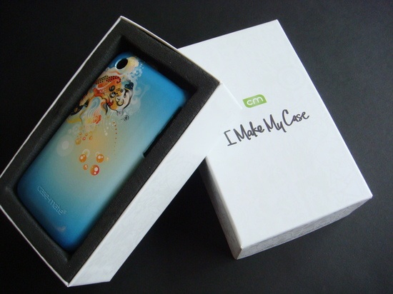
Case-Mate recently launched a nifty new site called ‘I Make My Case’ that allows you to design your own iPhone case. The interactive website includes art from 10 designers and artists, including the likes of Chuck Anderson, Hannah Stouffer, Anthony Yankovic, and Shadow Chen. The premise of the site is simple—you start with a blank case, add a background color, and experiment with different graphics until you’re satisfied with the design. The design-your-own cases are available for the iPhone 3G and 3GS.
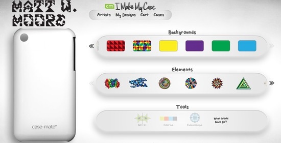
The website is very easy to use, even if it is a bit slow to load at first. I selected the artist Shadow Chen and got to work. The site displays a plain white iPhone case with a subtle Case-Mate logo at the bottom. There are eight background colors to choose from, along with a variety of loops, swirls, and other designs to play with. The undo button comes in very handy if you make a mistake.
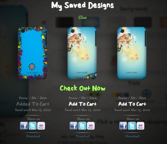
All told, it didn’t take more than a few minutes to create a design I was happy with. You can save multiple designs and share them via Facebook, Twitter, or Flickr. Check-out was fast and easy, and since the cases are a bit on the pricey side ($39.99 each), I was glad to see that shipping is free. The case was sent via USPS First Class Mail, and it arrived approximately 10 days after I ordered it.
The Case-Mate case comes in a snazzy white box, which is much better packaging than most iPhone cases. It also comes with a soft cleaning cloth and a screen protector.
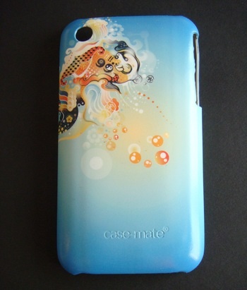
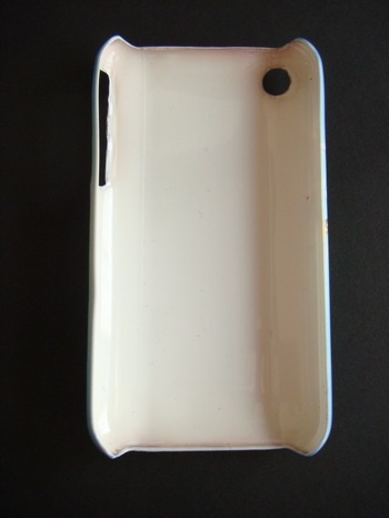
My first impressions of the Case-Mate case were mixed. They did an excellent job recreating my design—it looks exactly like it did on the computer screen—but the case itself feels flimsy to me. I was expecting more of a flexible rubber case, but if I had bothered to read the FAQ I would have seen that these cases are made from Lexan, a hard plastic. Even though Case-Mate says Lexan is “stronger, lighter, more flexible, and of higher quality” than other plastic cases, I still think it feels a bit thin.
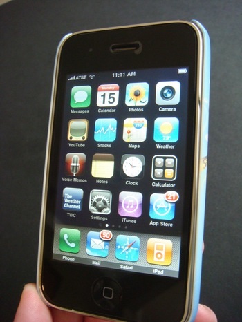
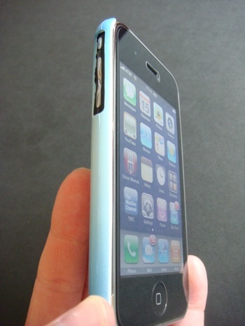
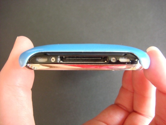
The case snaps on the iPhone easily, and it includes all the standard cut-outs for the camera, headphone port and volume button. Unlike most iPhone cases I’ve used, the Case-Mate case doesn’t cover any of the iPhone’s screen; in fact, it doesn’t even curl over the screen’s edge, so it has a very minimalistic look from the front.
The case does look very cool, and it’s nice to have a unique, eye-catching design in a sea of same-old iPhone cases. However, as you can see from many of the pictures, the cut-out around the volume button is a rough and jagged.
It’s pretty noticeable if you look closely, but the rest of the case is smooth.
Conclusion
Overall, my experience with the Case-Mate site was pretty good. Although I would prefer a rubberized case, I understand there are limitations based on their printing process. The jagged cut-out around the volume controls is disappointing—part of me feels that the case shouldn’t have any flaws after spending $40. I do like the case though, and I have been using it regularly. My initial concerns about the thinness of the case may be unwarranted—like the clutz I am, I’ve dropped my phone once or twice with no damage to the iPhone or case. Even so, this is case is designed more to protect against scratches than falls.
I would easily give the Case-Mate ‘I Make My Case’ site a wholehearted recommendation if it didn’t have that one flaw, but for now I have to give it a limited recommendation and an overall rating of 6.8 out of 10. The site is new though, so it could take some time to perfect the manufacturing process.



This looks insane!! smexy!
Thanks for collabing with my work!
<3