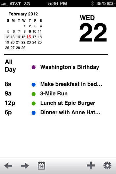
It wasn’t until I tried the Agenda ($0.99) calendar app that I realized the iPhone’s default Calendar app is kind of annoying to use, especially when it comes to its interface. Where Calendar forces the user to tap tiny buttons to move through dates, Agenda relies on finger swipes, which prove less frustrating for navigation through small or large amounts of time within the calendar. With Agenda, all it takes is one swipe to move between various calendar views (6 months, 1 month, 7 days, 1 day), where with Calendar it takes several button taps.
Another advantage of using Agenda is that it lets you infinitely scroll through your weekly calendar with a swipe of your finger. In the weekly calendar view, you can swipe up or down to infinitely scroll through the days. While it may not seem like a big deal, when comparing Agenda’s easy scrolling to Calendar’s tapping a touchscreen button a few dozens times, Agenda just provides a more pleasant experience.
Agenda has all the functionality of the default Calendar app; in fact, the screen for adding an event looks exactly the same, with all the same options like alerts for events and invitees for meetings, etc. So there’s not much of a learning curve to switching over to the app. I don’t do anything fancy with my iPhone calendar like creating multi-invite meetings, but Agenda does have those advanced features, including the ability to SMS or email all invitees to a meeting and inserting links to Google Maps in events.
Overall, I found that Agenda, with its swipe-based interface, is just a much smoother experience than the iPhone’s default Calendar app, which relies more on touchscreen buttons. And that’s why I’ve switched away from Calendar and replaced its icon in the coveted spot of my iPhone’s first homescreen with Agenda.


